





Model evaluation: the confusion matrix, Accuracy, Precision, Recall, F1, ROC, AUC and MCC
The chapter where your model stops bragging… and starts proving itself.
Training a model is easy. These days, with four lines of code, anyone can spin up an SVM, a decision tree or a neural network. The hard part isn’t training. The hard part is knowing whether it actually works.
You can have an SVM with a beautiful margin, a tree full of clever rules or a neural network with thousands of parameters… but if you don’t know how to measure, you’re flying blind. And flying blind with a model in production is the fastest way to make a bad decision with total confidence.
Evaluation is the moment of truth: where predictions stop being promises and come face to face with reality. And as you’re about to see, «getting a lot right» doesn’t always mean «working well.»
Let’s start at the beginning.
The confusion matrix: the map of your hits and misses
Picture your model as a student who has just finished an exam. The confusion matrix is the teacher’s grading: it doesn’t just give you the score, it tells you exactly what the model got right and what it got wrong, in surgical detail.
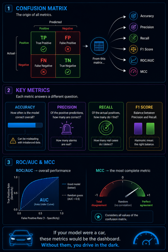
It all comes from one simple idea: every prediction lands in one of four boxes.
- TP (True Positive) → you said «positive» and it was positive. Hit.
- TN (True Negative) → you said «negative» and it was negative. Hit.
- FP (False Positive) → you said «positive» and it was negative. False alarm.
- FN (False Negative) → you said «negative» and it was positive. It slipped past you.
It’s like a police report of your predictions: who was guilty, who was innocent, and where you messed up. The neat part is that these four boxes sit in a 2×2 table, and everything else is born from them.
| Predicted Positive | Predicted Negative | |
|---|---|---|
| Is Positive (actual) | TP ✅ | FN ❌ |
| Is Negative (actual) | FP ❌ | TN ✅ |
Golden rule so you never get lost: the first word (True/False) tells you whether the model was right. The second (Positive/Negative) tells you what it answered. So «False Negative» = wrong + answered negative = it was positive and the model missed it.
An example that will follow us through the whole chapter
Let’s invent a concrete case and reuse it for every metric, so you can see how the same model can look like a genius or a disaster depending on how you look at it.
Imagine a fraud detector analyzing 1,000 transactions. In reality, only 40 are fraud (4%) and 960 are legitimate (96%). Our model produces these results:
| Predicted Fraud | Predicted Legit | |
|---|---|---|
| Is Fraud | TP = 30 | FN = 10 |
| Is Legit | FP = 20 | TN = 940 |
Keep these numbers handy. We’re going to squeeze them dry.
Accuracy: the metric that fools you most
Accuracy is the classic student who comes home bragging:
«I scored 97%.»
And it sounds spectacular. It’s calculated in the most intuitive way possible: hits divided by total.
With our numbers:
97%. Time to pop the champagne… until you read the fine print.
Look closely: out of 40 real frauds, it missed 10. One in four frauds went unnoticed. And it gets worse. A cheating model that simply said «everything is legit, no fraud here» without looking at anything would get 960 hits out of 1,000, that is, 96% accuracy… while being completely useless. It wouldn’t catch a single fraud.
That’s the great deception: when the dataset is imbalanced (one class is far more common than the other), accuracy inflates itself. It answers a question that is far too shallow:
«How many did I get right overall?»
But it doesn’t tell you what kind of errors you make, or whether those errors matter. And in the real world, not all errors cost the same.
Precision: of the ones I flagged, how many were real?
Imagine a spam detector. If it flags an email from your boss with the subject «urgent meeting» as spam, you’ve got a serious problem. That’s a false positive: you shouted «danger!» where there was none.
Precision measures exactly that:
«Of all the times I said ‘positive,’ how many were true?»
In our fraud detector:
Translated: of every 100 transactions the model flags as fraud, 60 really are and 40 are false alarms. Each false alarm means a legitimate customer with a frozen card calling the bank, furious.
High precision = few unnecessary scares. You want it high when being wrong in the «yes» direction is expensive: freezing good cards, deleting important emails, accusing an innocent person.
Recall: of the ones that existed, how many did I find?
Now switch scenarios. Imagine a cancer detector. Here what you absolutely cannot afford is telling someone «you’re healthy» when they’re sick. That’s a false negative, and it’s the most serious error possible.
Recall (also called sensitivity) asks:
«Of all the real positives that existed, how many did I manage to find?»
In our fraud case:
That is: of the 40 frauds that actually happened, the model caught 30 and let 10 escape. A 75% detection rate.
High recall = few misses. You want it high when letting a positive slip is a disaster: an undiagnosed illness, a fraud that goes through, a defective part that reaches the customer.
The eternal tension between Precision and Recall
Here’s one of the most important concepts in all of machine learning: Precision and Recall are like a blanket that’s too short. Pull it up to cover your feet and you uncover your shoulders.
If you ask your model to never let a single fraud escape (sky-high recall), it will start flagging anything remotely suspicious just in case… and it will fill up with false alarms (low precision). If you ask it to only raise the alarm when it’s absolutely certain (sky-high precision), it becomes so cautious that it lets doubtful frauds through (low recall).
There’s no such thing as «max out both.» There’s choosing your balance based on what each error costs you. And that brings us to the next metric.
F1: the diplomatic mediator
F1 is the referee who sits between Precision and Recall and says:
«It’s no good to me if you’re brilliant at one and terrible at the other. I want real balance.»
Mathematically it’s the harmonic mean of the two, and that odd word («harmonic» instead of «regular») has a trick to it: it harshly punishes either one being low.
With our numbers (Precision 0.60 and Recall 0.75):
Why the harmonic mean and not a regular one? Because with a regular mean you could cheat. A model with 100% precision and 0% recall (it flags a single case, gets it right, and forgets about everyone else) would have a regular mean of 50%, which sounds acceptable. But its F1 would be almost 0, exposing it as a disaster. That’s why F1 is so beloved for imbalanced datasets: if either leg is limping, F1 collapses and there’s no way to hide it.
ROC and AUC: how your model behaves across all thresholds
So far we’ve assumed something that isn’t so obvious: that the model says «yes/no.» But in reality, most models don’t say «it’s fraud,» they say «there’s an 82% probability of fraud.» You are the one who decides the threshold: «from 50% up I’ll call it fraud,» for example.
And here comes the uncomfortable question: why 50% and not 30% or 80%? Every threshold you pick changes all the numbers in the confusion matrix. Lowering the threshold catches more frauds (more recall) but sets off more false alarms (less precision), and vice versa.
The ROC curve solves this in one shot: instead of fixing one threshold, it tries them all and plots how the model behaves at each one. It’s like watching your model run the entire race, not just a sprint. It pits two things against each other:
- TPR (True Positive Rate) = the recall. On the vertical axis.
- FPR (False Positive Rate) = the proportion of negatives you flagged by mistake. On the horizontal axis.
The AUC (Area Under the Curve) is, literally, the area beneath that curve, and it sums up the whole race in a single number. Its interpretation is beautiful and intuitive:
«If I pick a positive at random and a negative at random, what’s the probability my model gives the positive a higher score?»
And you read it like this:
- AUC = 1.0 → perfect model, it always tells them apart.
- AUC = 0.5 → it distinguishes nothing, it’s flipping a coin (the dreaded diagonal on the chart).
- AUC < 0.5 → it’s working backwards, doing worse than chance.
The best thing about AUC is that it doesn’t depend on the threshold you pick, which makes it the ideal tool to compare two models cleanly and say which one separates the classes better overall.
MCC: the grown-up metric
If all the metrics were characters in a series, accuracy would be the one showing off at parties, and the MCC would be the serious engineer in the corner who doesn’t let anyone fool them.
The Matthews Correlation Coefficient has a virtue none of the others fully has: it uses all four boxes of the confusion matrix at once (TP, TN, FP and FN), so you can’t fool it by ignoring one class. It works well even when the classes are brutally imbalanced, which is exactly when the other metrics start to lie.
Its formula looks a bit scary, but you’ll never have to compute it by hand:
What’s worth memorizing is how to read it, because it runs from -1 to +1 like a classic correlation:
- +1 → perfect prediction.
- 0 → the model is purely guessing.
- -1 → perfectly wrong prediction (it fails at everything with admirable consistency).
If someone asks you for a single metric to sum up how good a classifier is and you want the most honest answer possible, MCC is your best bet.
Which one to use in each case?
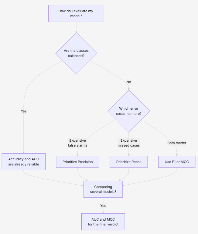
There’s no «best» metric in the abstract. There’s a best one for your problem, and it mostly depends on two questions: are your classes balanced? and which error costs you more? This is the cheat sheet every data scientist should have taped to the wall:
| Situation | Recommended metric | Why |
|---|---|---|
| Balanced dataset | Accuracy, AUC | Without imbalance, accuracy is already reliable |
| Imbalanced dataset | F1, MCC | They ignore the majority-class «trick» |
| Costly false positives | Precision | Measures how many alarms are real |
| Costly false negatives | Recall | Measures how many real cases you catch |
| Comparing models | AUC, MCC | They don’t depend on a specific threshold |
| Multiclass problem | Macro F1, Macro AUC, MCC | They average performance class by class |
And to decide it at a glance
In summary
- The confusion matrix is the foundation of everything: its four boxes (TP, TN, FP, FN) are the DNA that all metrics are born from.
- Accuracy is the most popular… and the most treacherous: with imbalanced data it inflates the score and hides the errors that matter.
- Precision and Recall answer different questions: «are my alarms real?» versus «am I missing anything?» And they compete with each other like a short blanket.
- F1 balances both and mercilessly punishes either one for failing.
- ROC and AUC judge the model across all thresholds at once, ideal for comparing.
- MCC is the most complete and robust metric: it uses all four boxes and won’t be fooled by imbalance.
If your model were a car, these metrics would be the dashboard. Accuracy is like looking only at the odometer: it tells you you’re moving, but not whether you’re about to crash. Precision, Recall, F1, AUC and MCC are the speedometer, the fuel gauge and the warning lights. Without them, you’re driving in the dark… convinced everything is fine.