





Dimensionality Reduction: PCA + SVD
The algorithm that flattens the universe without losing its essence
How to condense thousands of variables into just a few without destroying the information that actually matters.
Up to now we’ve worked with comfortable data, the kind that fits on a single sheet: spend and frequency, products inside a basket, points on a plane. Two dimensions, one chart, and everything under control. The problem is that the real world is rarely that kind.
The real world is multidimensional. A customer isn’t described by two numbers, but by dozens of behaviors. A product can have hundreds of features. A user leaves thousands of signals. An image is ten thousand pixels, and a vectorized text can be a vector of fifty thousand words. The richer the data, the more dimensions it drags along.
And there, the moment dimensions explode, a silent enemy appears: the curse of dimensionality. It sounds like the title of a novel, but it’s very real. As you add dimensions, data becomes sparse (each point ends up «alone» in a huge, nearly empty space), models slow down, distances stop meaning what we think they mean, and human intuition, which already struggles in 3D, simply switches off.
We need a way to flatten that universe without destroying it. To keep what’s essential and throw away the rest. That’s where PCA comes in. And behind PCA, working quietly like the engine under the hood, is SVD.
The problem: too many dimensions, too much noise
Imagine a dataset with 200 variables per customer. You can’t plot it. You can’t visualize it. And you certainly can’t form a mental picture of it. Our brains aren’t built to «see» in 200 dimensions.
But there’s good news hidden in that chaos: many of those variables say practically the same thing. They’re correlated. Monthly spend and annual spend rise and fall together. Visits per week and visits per month tell almost the same story. Clicks and time on page tend to go hand in hand. If two variables always move together, do you really need both?
PCA starts from exactly that idea and does something that looks like magic:
It finds the directions in which your data varies the most and lets you project it onto a much smaller space without losing what’s essential.
It’s like looking at a sculpture. If you look at it from the wrong angle, you see a flat, confusing silhouette. But there’s a perfect angle from which, all at once, you grasp its full shape without needing to walk all the way around it. PCA looks for that perfect angle for your data.
PCA: the algorithm that finds the important directions
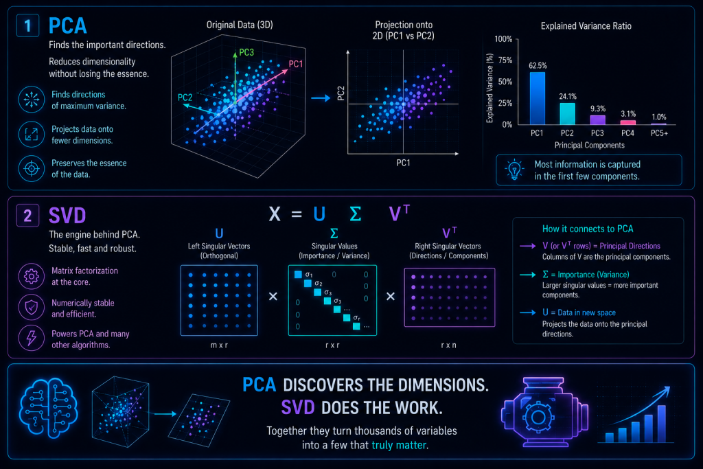
PCA stands for Principal Component Analysis, and its mission fits in one sentence: find the axes that capture the greatest possible variation in your data.
The key is the order. PCA doesn’t find axes at random, but by importance. The first direction (the first component) is the one along which the data spreads out the most, where there’s the most «life» and the biggest differences between observations. The second captures the greatest variation left over, always perpendicular to the first. The third captures what remains after those two. And so on.
The interesting part is that almost all the information usually concentrates in the first few components. The last ones barely contribute: they’re mostly noise.
The visual intuition
Picture a cloud of points floating in 3D, stretched out like a rugby ball. PCA looks at it and asks: in which direction does this cloud stretch the most? That’s the first direction. Then it looks for the second widest direction, perpendicular to the first. And then the third, perpendicular to both.
If the ball is very flat and very elongated, almost all of its shape lives in just two directions. You could squash it from 3D to 2D and barely notice the difference. That’s exactly what PCA does: it projects the cloud onto the directions that matter and discards the ones that only add irrelevant thickness.
What PCA does, step by step
Under the hood, the classic procedure follows this sequence:
- Center the data by subtracting the mean of each variable, so everything revolves around the origin.
- Compute the covariance matrix, which summarizes how the variables relate to one another.
- Find its eigenvectors and eigenvalues: the directions and the amount of variance in each one.
- Sort those eigenvectors by importance, from most to least variance.
- Project the data onto these new axes.
And here comes the interesting twist: in practice, almost nobody computes PCA this way. They use SVD.
SVD: the secret engine behind PCA
SVD stands for Singular Value Decomposition. It’s a mathematical tool that takes any matrix, no matter how large and messy, and breaks it into three clean pieces:
Each piece has a role:
- U contains the directions associated with the observations.
- Σ (sigma) contains the importance of each direction, that is, how much information it carries.
- V contains the bases of the new space, the axes we’ll project onto.
And here’s the connection that ties it all together: the principal components of PCA are exactly the columns of V, and the explained variances come from the values of Σ squared.
Put another way: PCA is, literally, SVD with a friendlier name. One is the concept you explain in class; the other is the machinery that runs when you hit «go».
Why SVD instead of eigenvectors?
Because when you move from the whiteboard to real data, SVD wins hands down. It’s more numerically stable (it makes fewer rounding errors), it’s faster and more robust, and it keeps working in awkward situations: when the covariance matrix is enormous, when you have more variables than samples (common in genomics or text), or when the data is poorly conditioned. In day-to-day work, PCA and SVD are, for all practical purposes, the same thing.
An example from our store
Let’s get concrete again. Imagine you now describe each customer with 50 variables: spend, frequency, visits, clicks, time on page, favorite categories, conversion rate, and a long list more. Fifty numbers per person. Impossible to visualize, hard to group, exhausting to analyze.
You apply PCA and something revealing happens. You discover, for example, that:
- 3 components explain 85% of all the variation.
- 2 components already capture 70%.
- 1 single component picks up 40%.
Suddenly, those 50 dimensions compress into 2 or 3. And with 2 dimensions, you can plot your customers on a normal chart. You can group them, see them as clouds, spot blocks that break away from the rest. Patterns that were buried under 50 columns of a spreadsheet finally rise to the surface.
What does each component represent?
This is where PCA stops being just a compression tool and becomes conceptually interesting. Each component isn’t one of your original variables, but a weighted mix of all of them. For example:
If you look at the weights, this component gives a lot of importance to spend and frequency. You could read it almost like a label: «this axis measures the customer’s overall level of activity». A customer with a high PC1 value is someone who spends, comes back, and browses a lot.
That’s why PCA does more than reduce dimensions: it creates new variables that capture concepts. Concepts we often didn’t even know were there, hidden among columns we used to look at separately.
Pros and cons
Like any tool, PCA is excellent for some things and clumsy for others. It’s worth being clear about this before you apply it.
| Pros | Cons |
|---|---|
| Reduces noise in the data | Components aren’t always easy to interpret |
| Reduces dimensionality | It’s linear: it can’t capture curved or complex relationships |
| Makes visualization easier | You can lose information if you reduce too much |
| Speeds up model training | It requires standardizing the data beforehand |
| Removes correlation between variables | |
| Uncovers hidden structures |
When to use PCA (and when not to)
Use it when you have many variables, when you suspect there’s correlation among them, when you want to visualize complex data in 2D or 3D, when you need to speed up a heavy model, or when you want to clean up noise and bring out the structure hiding underneath.
Avoid it when your data is strongly non-linear (PCA only understands straight lines, so a spiral- or curve-shaped relationship escapes it), when you need absolute interpretability of every variable, or when your variables are on very different scales and you haven’t standardized them first. This last point matters: if one variable ranges from 0 to 1 and another from 0 to 100,000, the second will dominate the analysis purely because of its size, not its actual relevance.
In summary
PCA is the algorithm that flattens the universe. It removes noise, finds the directions that truly matter, condenses hundreds of variables into just a few, and lets us visualize what was once invisible. And SVD is the silent mathematical engine that makes all of it possible, quickly and stably.
If clustering was about discovering shapes, and association rules about discovering relationships, PCA goes one step further: it’s about discovering dimensions.
It’s the algorithm that looks at your dataset full of columns, takes a deep breath, and tells you:
«You don’t need 200 variables. Three will do.»