


Polynomial Regression (Part 5)
When a straight line isn’t enough — and how to bend it without breaking anything
Over the last four parts we’ve built up a complete toolkit: a line, a way to measure how wrong it is, a method to improve it step by step, and the exact formulas the computer runs at every iteration. If you’ve followed along this far, you can genuinely say you understand how a machine learns a straight line.
But here’s the thing about reality: it’s rarely straight.
House prices don’t rise at a constant rate forever. A plant’s growth speeds up and then plateaus. The relationship between speed and fuel consumption is a curve, not a ramp. If we insist on fitting a straight line to data that bends, we’re not being simple — we’re being wrong.
So the natural question is: can we teach the model to learn curves? And the beautiful answer is: yes, and we barely have to change a thing.
1. The key insight: transform x, not the model
This is the single most important idea in this entire post, and it’s the one that most explanations get wrong or skip over entirely. So let’s say it clearly:
Polynomial regression is not a new type of model. It’s the same linear regression we already know, fed with richer ingredients.
Here’s what that means. In Parts 1–4, our model received a single input, , and produced a prediction:
One coefficient for the intercept, one for the slope, done. But what if, before handing the data to the model, we manufactured some extra columns? What if, alongside the original , we also gave it ? Then the model would have two inputs to work with and would produce:
From the model’s point of view, nothing has changed. It still sees a bunch of inputs, multiplies each one by a coefficient, and adds them up. It’s still doing linear regression. It has no idea that the second column is just the first column squared — it doesn’t care. It treats and as two completely independent features and finds the best weight for each.
The trick is entirely on our side: we transform the input, not the algorithm.
Each power of becomes a new column in the data table. We’re expanding the model’s vocabulary, giving it more building blocks to combine, so it can describe shapes that a single straight line never could. And this is what people mean when they say polynomial regression is «linear in the parameters»: the coefficients still enter the equation as simple multipliers, even though the relationship between and is now a curve.
Think of it like cooking. Linear regression is a recipe with one spice. Polynomial regression doesn’t change how you cook — you still mix, heat, and serve the same way — it just opens the spice rack wider. More spices, more complex flavors. Same kitchen, same technique.
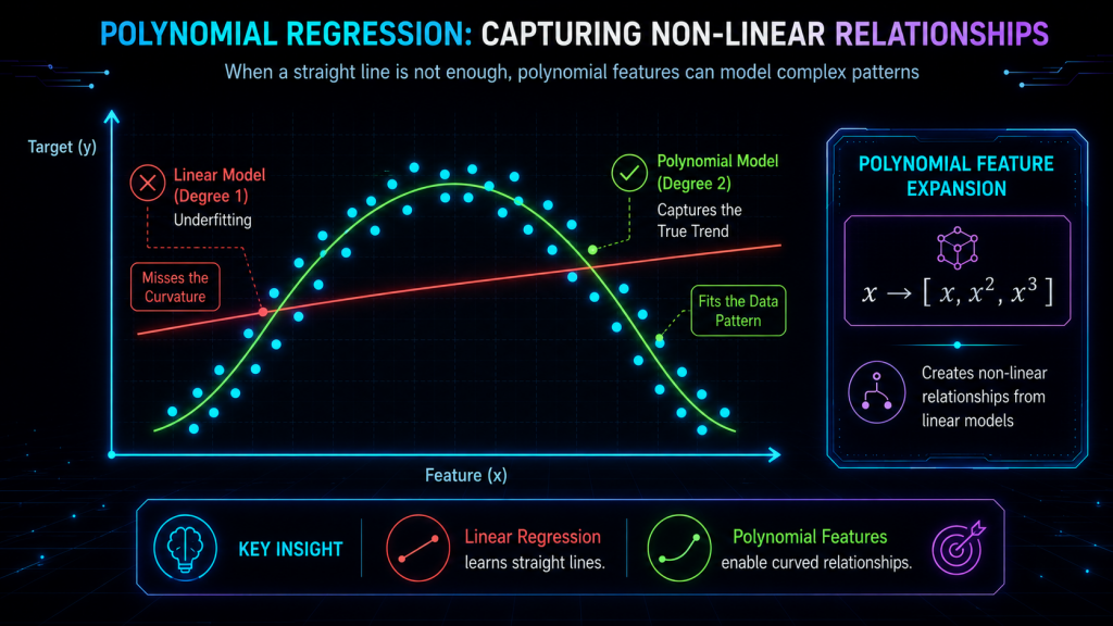
2. A visual story: why the straight line fails
Imagine you’ve collected data on how a car’s fuel efficiency changes with speed. At low speeds, efficiency climbs as the engine warms up. Around 80–90 km/h it peaks. Then at high speeds it drops because air resistance takes over. The data, if you plotted it, would trace a smooth arch — an inverted U.
Now try to lay a straight line through that arch. No matter how you tilt or shift it, it will cut right through the middle, missing the rise on the left, the peak in the center, and the drop on the right. The line simply doesn’t have the vocabulary to say «go up, then come back down.» Its entire repertoire is «go up» or «go down,» one or the other, forever.
A degree-2 polynomial (a parabola) fits this naturally. It can rise, curve over, and fall — exactly the shape the data is tracing. The prediction is no longer a rigid plank; it’s a flexible arc that follows the real trend.
And if your data has an even more complex shape — say it dips, rises, dips again — a degree-3 polynomial can capture that double bend. Each additional degree gives the curve one more «elbow,» one more place where it’s allowed to change direction.
The progression looks like this:
| Degree | Shape it can describe | Number of coefficients |
|---|---|---|
| 1 (linear) | A straight line | 2 () |
| 2 (quadratic) | A single curve (one bend) | 3 |
| 3 (cubic) | An S-shape (two bends) | 4 |
| d | Up to bends |
3. The general formula
Writing it out fully, a polynomial regression of degree predicts:
Each term adds a new layer of flexibility:
- is still the baseline — where the curve crosses the vertical axis.
- captures the linear trend, the overall tilt.
- allows the curve to bend once — to open upward or downward like a bowl.
- adds an inflection, letting the curve change from concave to convex (or vice versa).
- Higher powers add finer and finer wiggles.
And here’s the behind-the-scenes reality that strips away any mystery: when the computer actually trains this model, it doesn’t see a polynomial. It sees a data matrix where each row is a data point and each column is a feature. For a degree-3 polynomial, the matrix looks like:
That first column of ones is there for . The rest are just powers of . There’s no magic — only more columns. And the algorithm that finds the best values? It’s the exact same one we built in Parts 3 and 4.
4. How it trains: exactly like before
This is where everything we’ve done so far pays off. If you understood Part 4, you already know how to train a polynomial regression. Nothing changes except the number of coefficients to update.
The cost function is still the MSE:
The gradient still tells us which direction to move each coefficient. And the update rule is still the same subtraction:
The only difference is that now we have coefficients instead of 2, so we compute partial derivatives and take simultaneous steps. But each individual step follows exactly the same logic:
- For : the derivative depends on the average error (just like before).
- For : the derivative weights each error by (just like before).
- For : the derivative weights each error by .
- For in general: the derivative weights each error by .
See the pattern? It’s the exact formula from Part 4, but where before we only had and , now we extend the same idea to . The machinery is identical. The only thing we did was add more features to the input, and the algorithm scaled up automatically.
If you understood Part 4, you already know how to train a polynomial. Full stop.
5. A numerical example: from line to curve to chaos
Let’s make this concrete with a tiny dataset. Suppose we have five data points that follow a gentle curve:
| 1 | 2.5 |
| 2 | 6.8 |
| 3 | 12.0 |
| 4 | 17.9 |
| 5 | 25.1 |
If you look at the jumps in (4.3, 5.2, 5.9, 7.2), they’re getting bigger — the data is accelerating. A straight line would try to split the difference with a constant slope and would systematically undershoot at the ends and overshoot in the middle.
A degree-1 fit (straight line) might give us something like . It captures the general upward trend, but the pattern of errors — negative, positive, positive, negative, negative — reveals that it’s missing a curve.
A degree-2 fit (parabola) adds the term and might produce . Now the predictions hug the data far more closely. The errors shrink, and they no longer show a pattern — they look random, which is exactly what we want.
A degree-10 fit on five data points? It can pass through every single point with zero training error. Sounds perfect, right? It’s the opposite. Between the points, the curve goes on wild excursions — swooping up and plunging down in ways that have nothing to do with the real relationship. Feed it and it might predict 47 or -12, despite all the training points being between 2 and 26. The model hasn’t learned the pattern; it’s memorized the noise.
And that brings us to the single biggest danger of polynomial regression.
6. The big problem: overfitting
Overfitting is what happens when a model is so flexible that it stops learning the signal and starts chasing the noise. And polynomial regression is spectacularly prone to it.
Here’s the intuition. Every real dataset has two components mixed together: the true underlying pattern (signal) and random fluctuations (noise) from measurement error, natural variation, or plain bad luck. A good model captures the pattern and ignores the noise. An overfit model captures both, and since noise doesn’t repeat in new data, the model fails the moment it encounters something it hasn’t memorized.
The symptoms are unmistakable:
- Training error is near zero — the curve threads through every point.
- Validation error is huge — on new data the predictions are wildly off.
- The curve oscillates violently between data points, with coefficients that balloon to enormous positive and negative values to force the polynomial through each point.
A useful analogy: imagine trying to describe the coastline of Spain. A low-degree polynomial is like saying «it goes roughly east along the Mediterranean, then curves south, then heads north up the Atlantic.» That’s a useful simplification. A very high-degree polynomial tries to trace every inlet, every beach, every rock — and when you use it to predict what the coast looks like between your measurements, it invents fjords and peninsulas that don’t exist.
More flexibility is not always better. The art is finding the sweet spot: enough complexity to capture the real pattern, not so much that you start hallucinating structure in randomness.
This is the problem that Part 6 (Ridge and Lasso) will directly address. But before we get there, how do we at least choose a reasonable degree?
7. How to choose the degree of the polynomial
The core principle is simple: don’t judge the model on the data it trained on. Judge it on data it hasn’t seen.
The standard tool for this is cross-validation, and the most common flavor works like this:
- Split your data into, say, 5 equal folds.
- For each candidate degree (1, 2, 3, …), train the model on 4 folds and measure its error on the remaining fold.
- Rotate which fold is left out and repeat, so every data point gets a turn as the «unseen» test.
- Average the errors across all folds. The degree that gives the lowest average validation error wins.
What you’ll typically see when you plot training error vs. validation error as the degree increases:
- Training error drops steadily — more flexibility always lets you fit the training data better.
- Validation error drops at first (the model is learning the real pattern), hits a minimum (the sweet spot), and then starts climbing (the model is now fitting noise).
That U-shaped validation curve is one of the most important plots in all of machine learning. The bottom of the U is your answer.
A good rule of thumb: start simple. Try degree 2. If it’s not enough, try 3. Rarely in practice do you need to go above 4 or 5. If you find yourself reaching for degree 8, the problem probably isn’t the degree — it’s that polynomial regression might not be the right tool for that data.
8. When to use polynomial regression (and when not to)
Polynomial regression shines when:
- The relationship between and is clearly nonlinear but smooth — a curve, not a zigzag.
- You have a single input variable (or very few). With many inputs, the number of polynomial terms explodes combinatorially and becomes unmanageable.
- You want something simple and interpretable that goes one step beyond a straight line.
It’s not the best choice when:
- The data has many features — tree-based models or neural networks handle high-dimensional nonlinearity far better.
- The relationship is periodic (repeating waves) — trigonometric functions or Fourier features are more natural.
- You need to extrapolate far beyond your data — polynomials go haywire outside the range of the training data. A degree-5 polynomial that fits beautifully between and can predict absurd values at .
9. Connection to Part 6
We’ve seen that polynomial regression gives us a powerful way to model curves, but it introduces a dangerous tradeoff: the more flexible we make the model, the more it risks overfitting. And our only defense so far is to choose the degree carefully.
But what if there were a way to keep a high-degree polynomial — with all its expressive power — while actively penalizing it for getting too wild? A way to tell the model: «You can use all these terms, but I’m going to charge you a price for making the coefficients too large»?
That’s exactly what regularization does. In Part 6 we’ll introduce Ridge and Lasso regression, two techniques that add a penalty term to the cost function to keep the coefficients under control. They’re the seat belt that lets you drive a more powerful car without flying off the road.
In summary
- Polynomial regression is not a new model — it’s linear regression with extra features created by raising to higher powers.
- The model is still linear in the parameters ( values), even though the relationship between and is a curve.
- Training uses exactly the same gradient descent from Part 4, just with more coefficients to update.
- Higher-degree polynomials are more flexible, but flexibility has a cost: overfitting, where the model memorizes noise instead of learning the pattern.
- The right degree is chosen by cross-validation, looking for the sweet spot where validation error is lowest.
- Polynomial regression works best for smooth, low-dimensional nonlinear relationships and should be used with caution for extrapolation.
- In Part 6, we’ll learn how to tame overfitting with regularization (Ridge and Lasso), so we can use flexible models without losing control.