





Dimensionality Reduction: LSA + t‑SNE
The algorithm that understands meaning… and the one that draws hidden worlds
How to compress texts into concepts, and how to turn impossible data into maps that look like magic.
So far we’ve met two characters with very different personalities. PCA, which flattens the universe by looking for where the data varies the most. And LDA, which separates universes by looking for the borders between classes. Two philosophies, two ways of looking at a cloud of points.
But there’s one kind of data that resists both, that won’t be tamed by variation or by borders: text.
Because a text isn’t just any cloud of points. A text has meaning. It has context. It has relationships between one word and another that no number, on its own, can capture. When we turn it into figures (bag of words, TF‑IDF, embeddings…), we suddenly find ourselves with monstrous vectors: 10,000, 20,000, 50,000 dimensions. Too much noise. Too much empty space. And, of course, impossible to visualize.
That’s where today’s two protagonists come in, and the beautiful part is that they don’t compete: they complete each other.
- LSA reduces dimensions by understanding meaning.
- t‑SNE visualizes complex data by drawing maps that look like magic.
One compresses. The other reveals. Together they form an almost perfect duo for working with language.
LSA — Latent Semantic Analysis
The algorithm that uncovers concepts hidden among thousands of words
LSA was born to solve a problem that, once you see it, you can’t unsee:
Texts have too many words, but very few concepts.
Think about it. Just because your vocabulary has 50,000 possible words doesn’t mean a single document contains 50,000 ideas. Maybe it has three: economics, politics, and energy. Or two: travel and food. Or just one: sports. The words are many; the underlying ideas, very few.
LSA sets out to do exactly that: find those few hidden concepts buried under the avalanche of words.
How does it do it?
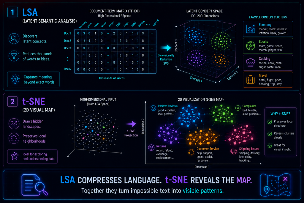
LSA takes your document-word matrix (a TF‑IDF matrix, for example) and applies an old friend: SVD. Yes, the same decomposition we already saw inside PCA.
The machinery is identical, but here the reading changes completely:
- U → your documents, now represented in a space of concepts.
- Σ → the importance of each concept (how much weight it carries overall).
- V → your words, placed within those same concepts.
And that new representation lets you say things that were unthinkable before:
- «This document is 70% about politics and 30% about economics.»
- «This word is strongly associated with the concept of technology.»
- «These two texts are similar because they share the same latent concepts, even though they don’t use the same words.»
That last point is the jewel. LSA doesn’t understand meaning the way a human does, but it discovers semantic patterns good enough to know that «car» and «automobile» live close together, even though they’re spelled differently.
Why does it work?
Because words don’t show up at random. They show up in company. If a document is about soccer, sooner or later you’ll see goal, stadium, striker, referee, and league. If it’s about cooking, you’ll find recipe, oven, ingredients, flavor, and chef.
LSA detects those co‑occurrences (which words tend to appear together) and groups them into latent concepts. It doesn’t read: it counts company. And it turns out that counting company, at scale, looks an awful lot like understanding what a text is about.
What is LSA good for?
Its home turf is anything involving organizing language. It’s used to group documents by topic, to find similar texts, to improve search engines (surfacing relevant results even when they don’t contain the exact word), and as a step before clustering, because it delivers compact semantic representations instead of giant, noisy vectors.
In a single sentence:
LSA is PCA applied to language.
t‑SNE — t‑Distributed Stochastic Neighbor Embedding
The algorithm that draws hidden worlds in 2D
If LSA compresses texts into concepts, t‑SNE chases something completely different and, in a way, more artistic:
t‑SNE creates visual maps where similar things end up together and different things end up far apart.
It’s a non‑linear visualization algorithm, and it’s worth being clear about what it doesn’t do, because that’s where its personality lies. It doesn’t try to explain variation, like PCA. It doesn’t try to separate classes, like LDA. It doesn’t look for concepts, like LSA. t‑SNE pursues something much more human, almost intuitive:
Preserving the neighborhood of the data.
If two points are similar in 300 dimensions, t‑SNE places them together on the plane. If they’re different, it pushes them apart. Nothing more. And from that one simple rule, something astonishing emerges.
The intuition
Imagine 10,000 documents represented in 300 dimensions (coming from LSA, from embeddings, from whatever). Visualizing that is, literally, impossible for a human brain.
t‑SNE does something elegant in three steps:
- It looks at who is a neighbor of whom in the original 300‑dimensional space.
- It scatters the points across a 2D plane, trying to respect those neighborhoods.
- It adjusts the positions over and over, iteratively, until the groups form on their own, like magnets finding their place.
The result is a map that looks like sorcery: crisp clusters, separated topics, subgroups within groups, soft borders, and patterns PCA would never have shown you, because PCA only draws straight lines and here the structure is curved, organic, twisting.
Why did t‑SNE become so famous?
Let’s be honest: partly because it produces spectacular graphics. But it’s not just aesthetics. When you feed it text, image, or audio embeddings, t‑SNE reveals things that were there all along, hidden: thematic groups, visual styles, musical genres, customer types, hidden segments nobody had labeled. That’s why it became the favorite tool for exploring complex data and «seeing with your own eyes» what a model learned on the inside.
LSA + t‑SNE — the perfect duo
Now you can see why they work so well together. Each one covers the other’s blind spot.
LSA brings you down from 50,000 dimensions to 100 or 200, keeping the semantic essence. t‑SNE takes those 200 and carries them down to 2, where you can finally look at them.
LSA discovers the concepts; t‑SNE draws them. LSA compresses; t‑SNE reveals. LSA brings order to language; t‑SNE turns it into a map you can scan with your eyes.
It’s the difference between having a perfectly cataloged library… and also having a floor plan that shows you where each section is.
An example in our store
Let’s get concrete again. Suppose you have 20,000 customer reviews, vectorized with TF‑IDF, which leaves you with vectors of 50,000 dimensions. An impenetrable wall of numbers.
You apply LSA → you reduce to 150 concepts. You apply t‑SNE → you reduce to 2 dimensions. And then you open the chart and this appears:
- a clear cluster of positive reviews,
- a cluster of complaints about shipping,
- a cluster of problems with returns,
- a cluster of comments about customer service,
- and, within each one, finer subgroups.
What a moment ago was pure textual noise has turned, without anyone labeling anything, into a readable map of what your customers think.
Pros and cons
Since each algorithm shines and stumbles in different places, it’s worth looking at them separately.
LSA
| Pros | Cons |
|---|---|
| Reduces text dimensionality dramatically | It’s linear: it only captures simple relationships |
| Uncovers latent concepts you can’t see at a glance | Doesn’t capture complex meanings or nuance |
| Very fast | Doesn’t understand the deep context of a sentence |
| Based on SVD, stable and robust | Falls short compared to modern embeddings |
t‑SNE
| Pros | Cons |
|---|---|
| Spectacular, revealing visualizations | Only good for visualizing, not for feeding models |
| Uncovers hidden clusters | Doesn’t preserve global distances (the «big picture» geometry is misleading) |
| Fits perfectly with embeddings | Can be slow with very many points |
| Ideal for exploratory analysis | Results depend on its hyperparameters (such as perplexity) |
One important warning about t‑SNE, because it trips up a lot of people: the distances between clusters mean nothing. Two groups appearing far apart on the map doesn’t mean they’re «very different»; t‑SNE cares about local neighborhoods, not large distances. Read it like a subway map: it tells you which stations are connected, not the actual kilometers between them.
When to use this duo (and when not to)
Use it when you have already-vectorized text, you want to discover hidden topics, you need to visualize semantic clusters, you’re exploring complex data without quite knowing what you’re looking for, or you’re working with text, image, or audio embeddings.
Avoid it when you need absolute interpretability (t‑SNE doesn’t give you explanations, it gives you a drawing), when you rely on preserving your data’s global distances, or when the volume is so huge that t‑SNE becomes too slow (that’s when it’s worth looking at alternatives like UMAP).
In short
LSA and t‑SNE are two halves of the same idea: making sense of data that, in raw form, there’s no way to look at. LSA uncovers the latent concepts hidden among thousands of words. t‑SNE draws those concepts on a map that reveals invisible patterns.
And with this, the family is nearly complete:
If PCA was discovering dimensions,
and LDA was discovering separations,
LSA is discovering meanings,
and t‑SNE is discovering landscapes.
It’s the duo that looks at your data, rolls up its sleeves, and says:
«Let me compress your ideas… and then show you the map where they live.»